Overview
Adelante Mujeres Website Redesign
Increasing program participation through improved accessibility &
user experience
10-Minute Read
Role: UX Design Volunteer
Project Length: 60-hr
Discovery Phase
Context, Problem & Goals
Context
Adelante Mujeres serves the Latino population, especially women, in Washington State, with a focus on Portland. They offer programs such as Adult Education and Small Business Development Classes to help Latino women gain skills and confidence.
They needed help in doing a heuristic evaluation & redesigning user flows.
Problems & Goals
Insufficient number of people signing up for the programs
⚠️
Current flow is not intuitive, and a consistent sign-up process creates friction.

Defining the Problem
Data Gathering & User Research
2
💬
Research Interview
Talked to 5+ Participants to Gather Feedback
3
🗂️
Affinity Mapping
Gathered 3x insights about pain points and flow of how participants navigate through the website.
Key Findings
Research Insights
⚠️ Some programs require users to send an email to register for creates friction.
⚠️ Sign-up CTAs are buried in most pages.

📄
Content & Readability
⚠️ Similar information components but inconsistent layout.

👁️
Visual Design & Accessibility
⚠️ Overlaid text on photos or videos reduces visibility & accessibility.
⚠️ Non-descriptive images create confusion.

⚠️ Text-heavy user stories increase user fall-off rate.

Challenges & Constraints
Addressing Information Architecture:
Adelante Farmer's Market
Major Challenge:
Integrating the Independent Farmer's Market IA
Two independent websites with independent IA embedded (Farmer's Market, Clinica Esperanza), creating an inconsistent user experience.
⚠️ User Confusion
⚠️ Navigation Issue
Current state analysis:

Home
Get Involved
Market Events
Weekly Market Map
Our Markets
Vendor Application
About
Original Structure

✨ My Design Solution

What I did:
I re-organized information architecture so each column represents one category, creating a clear visual hierarchy and reducing cognitive load.
key decision:
Consolidate navigation while maintaining Farmer's Market as a distinct section with clear visual connection to the main brand.
Trade-off & Decision
Design Challenges, Decisions & Trade-offs
exploration phase
Initial Approach
Farmer’s Market flow into the main site with similar template as the Programs Page
⬇️
discovery
Critical Finding
I found that the farmers' Market has established its own system already, with a distinct website.
⬇️
trade-off Decision
Decided to keep Farmer’s Market as a distinct section within the top navigation bar to show respect to existing user habits while improving discoverability.
design iterations


Vendor's Directory
Final Navigation Structure
Preserved navigation structure that users are familiar with, while improving discoverability through adding drop-downs for Farmer's Market.
Home
Programs
Farmer's Market
About
Get Involved
Connect
Solution: Building Systems for Scalability
Standardized Layout for Scalability
✅ Maintained content flow
✅ Redesigned layout for clarity & predictability
To support scalability across 10+ program pages, I kept the original information flow but redesigned the layout to make content easier to read, scan, and navigate. This allowed the organization to maintain its existing content structure while improving the overall UX.
preserved information flow
Hero Section
Upcoming Classes
Program Components
Program Strategies
Impact
Testimonials
implemented examples

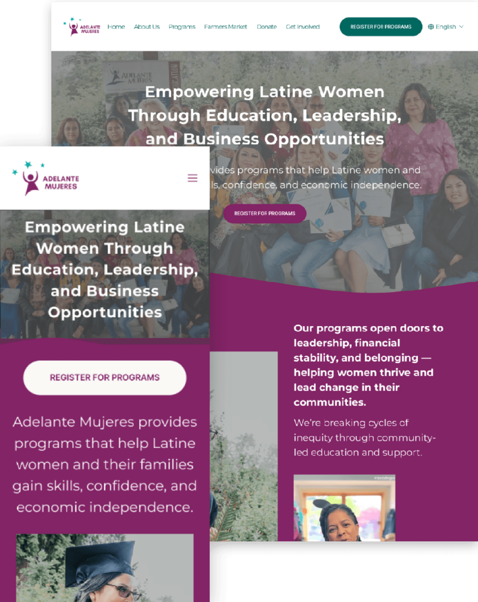
Hero with clear headline hierarchy

Class schedule with better visibility

Standardized program component cards


Impact stories + readable text
Solution: Building Systems for Scalability
Section-by-Section Improvements:
Same content, stronger structure
problem addressed
⚠️ Low scannability
⚠️ CTA buried
before & after comparisons
Original Hero Section

MY DESIGN

✅
Hero Image with clear explanation
Original upcoming classes section

MY DESIGN

✅
different classes separated into different blocks are visualized
✅
CTA is placed where users expect it with a clear visual hierarchy
Original program strategies

MY DESIGN

✅
Reduced full-width text + better text-image alignment
Design System Applied Across All Sections
These improvements were systematically applied to Program Components, Impact, and Testimonials sections across 10+ program pages:
✅ CTA placement where users naturally expect them
✅ Clear hero images paired with explanatory text
✅ Improved text-image alignment and reduced full-width text blocks
Solution: Building Systems for Scalability
Universal Sign Up System
problem addressed
⚠️ One-page long form
⚠️ Creates abandonment
Original Form

⚠️ Original Issue
A single-page form with 15+ fields created a high cognitive load and abandonment.
MY DESIGN

✨ Design Solution
A multi-step form with a progress bar and a confirmation step reduces cognitive load and abandonment.
Design approach
I utilized the sign-up form from the Adult Education Program as a reusable system, and the following are the reasons behind:
🖖 Split across pages
➕ Address bar
➕ Confirmation step
📍Next Steps & Future Exploration
However, every point of data collection requires user effort. Therefore, the following steps are recommended:
Test progressive form strategies to reduce friction:
1️⃣ Reorganize into high-conversion sections first
2️⃣ Split into registration + profile completion steps,
or use progressive disclosure to gather information over time
Solution: Building Systems for Scalability
Increased Visibility of Registration & Programs
problem addressed
⚠️ No dropdown to see overview of projects
⚠️ Content visibility
I improved the writing & visibility of the hero section so users can understand the services provided at a glance.
➕ Added Programs Dropdown on Hover
✅ Moved CTAs above the fold
✅ Sticky positioning
✅ Modified Wordings
✅ Moved content from the 2nd Section to hero
key improvements
Original Hero Section
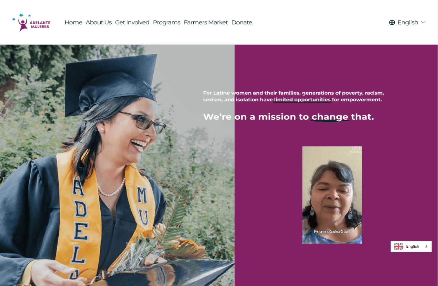
MY DESIGN

Impacts of this Systematic Approach
Project Impact & Outcomes
Scalable System
This template provides a flexible and consistent framework for all future programs, ensuring standardization in information flow and layout.


Streamlined User Path
As mentioned by the marketing director, the key is to increase user engagement with programs. Thus, I reduced 2 Clicks + scrolling to get into the registration form by adding the CTA to the Home Page.

Original Flow:
4 CLICKS

MY DESIGN:
2 clicks

Key Takeaways
Design Within Constraints
Real-world projects rarely start from scratch.
Sometimes the best UX decision is to preserve what's working rather than force unnecessary integration. User familiarity is valuable.
System Scales Impact
Identify repetitive patterns
Build reusable templates
Scalability
Scope Discipline
Recognizing when to separate projects (e.g. Farmers Market)
Kept Timeline Achievable
Technical Growth
Expanded Accessibility Knowledge
Learned developer, data analytics' jargon other than color and size.
Understood Stakeholder Perspectives
Designers, developers and project managers have different priorities even delivering the same project.
Gained Website
Auditing Skills
Gained practical experience with Semrush (SEO, crawling, robots.txt, performance)