Overview


Context, Problems & Goals
Context, Problem & Goals
People don't know if they're saving enough, creating constant financial anxiety.
Current banking apps show balances but not "Am I on track?" Users have data but lack guidance, so they disengage entirely.
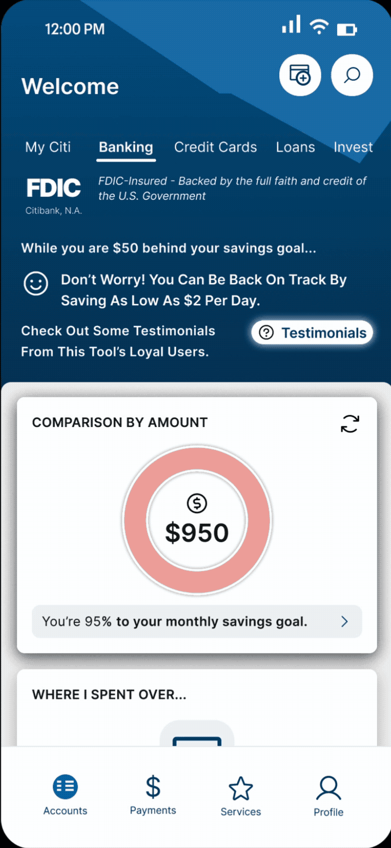
Therefore, this is a feature designed to plug into FDIC insured banks, with Citibank as the example to demonstrate.
Solution
The immediate idea of 50/30/20 rule as default + help them set up HYSA account + automating 20% to to save to HYSA per previous paycheck came up
Goals
50/30/20 Benchmark – Shows savings status, allows customization
Smart spending analysis – Identifies subscription cuts to boost savings
Data Gathering
Research Methodology
I used the following data collection methods and summarized 3 personas according to their income type and money handling habits.
🎙️
1
Research Interviews
6 Interviewees
All lived in the United States
👣
2
Journey Mapping
Financial planning behaviors
Emotional ups and downs

Competitive Landscape
What Competitors Are Missing
I analyzed 6 major competitors to identify market gaps, and found the following.


Original Pivot
My Original Plan: Design HYSA Onboarding with Auto-savings
Problem: all 6 research participants have a HYSA account, and I realized I was solving the wrong problem.
My Rationale behind this Idea:
Assumption:
Users need HYSA set up
Reality:
Users already have HYSA set up
When I asked about how people handle their paycheck, 1 interviewee answered:
‘I just automate stuff’
Participant 1
My follow-up questions about planning suddenly felt useless.
💡 Instead of moving on, I scheduled a deeper conversation about her emotional journey with financial planning.
Key Insight
‘Unvested money shows as cash. I don't know how much I need to save.’
Solution 1
1
Personalized Benchmarking: Goal Tracking & Variable Income
Regarding the problem that no one knows their baseline, I decided to add a dashboard to visualize the spending analysis with simple charts for users to be able to see things at a glance.
I also provided the option to add additional income per users' comments in 1st round of usability testing.


➕ ADDITIONAL INCOME

Solution 2
It took a few steps to arrive at the solution of proactive proportion adjustment to solve the rigidity of the 50/30/20 rule problem. While users expressed the desire for flexibility in interviews, I decided not to add it, as from my perspective, it is sufficient by providing a benchmark to solve the problem of users not knowing how much they need to save, did not want to overcomplicate MVP, and it was actually fine in 1st testing.
However, more and more voices revealed the rigidity of the 50/30/20 rule, and I realized this is a serious issue and made amendments.

Phase 1: Initial Default
Only 1/6 participants initially flagged the rigidity of the
50/30/20 rule.

Phase 2: A Little Educational Moment
Despite the prompt, further testing confirmed the default was rigid.
Explicitly added the feature which provided flexibility for Variable Earners and precision for Smart Automators.

Phase 3: Final Solution (Post-Testing)
Final solution demonstrated using functional code (Figma Make) to show dynamic proportional adjustment.
Solution 3
3
Actionable Guidance: Optimizing Subscriptions
Provided that all users want actionable guidance, but not just data, I took it a step further to explore options for that, and landed a solution to 1️⃣ get context; 2️⃣ point out possibilities with maths done; 3️⃣ let users reflect and make a decision.


Other Things Explored
👣
In-Line Peer Stories & Validation of Design Tension
To encourage users to be financially healthy, I thought of bringing in social aspects so people can look at how their peers are doing. A lot of problems arose when it started, and there was a split opinion on whether this function should exist. Supporters found it motivating, opposers found it undermines privacy or distracting. The function evolved as follows:


Final Pivot: Other Things Explored
👣
From Peer Stories to Generalized Testimonials
Instead of detailed stories of how individual users improve, I simplified it into a generalized testimonial section, it therefore promotes the feature yet do not reveal sensitive, emotional finances of users.


Key Takeaways
Designing something to integrate to an existing app is really different from starting from scratch, and also closer to real world projects. And the following is what I found the most important in this project:
🏛️
Branding Consistency
Successful integration requires matching the existing UI Design (Citibank design system).
Key Action
Ensure new elements (buttons, fonts) blend into existing UI and DO NOT look like a discrete function.
⚖️
Keep Research Plan Flexible
My design pivot did not come from my research plan, it emerged unexpectedly.
Key Action
Build your research questions to allow for unexpected answers, not just to validate what you already think.
⚡️
Start Simple, Polish Later
Balancing time-consuming hi-fidelity prototyping with efficient visual communication is crucial for productivity.
Key Action
Prioritize solving user problems over polishing edge cases.
⏱️️
UX Value Over Tech Complexity
Technical prototyping challenges (variables, CTAs) must not overshadow the core value of the
UX design.
Key Action
Prioritize better UX instead of prototyping the whole design.
Key Takeaways
Enjoyable Parts
No one taught us about financial literacy growing up; we all avoided talking about money, and that's why I wanted to make some impacts with this project. Unexpectedly, there is a lot more I gained from it, as an emerging UX Designer:
💬
Listen and Design for empathy
UX is about listening, not validating. Be prepared to pivot based on user needs and emotions, not initial hypotheses.
The Insight
e.g. One participant shared her journey to financial independence after college, abandoning comforts, navigating financial ups and downs, and transforming from panic to pride. Design should prioritize user empowerment.
🔍
Challenge Assumptions
High user familiarity with HYSA accounts requires deeper digging to uncover the real business gap: The emotional and practical gaps in financial planning.
The Pivot
HYSA onboarding
🔽
Benchmark Guidance
🌍️
Build for
Scalability
While this is designed as a plug-and-play framework for FDIC-insured banks, to scale globally, balance specificity (culturally relevant context) with generalization is required.
Key Action
Study different nations’ banking systems, and find a generalized framework.